Failing to Map Historical Maps

Building off of Martha’s previous post, I’m going to discuss some challenges of mapping projects with old maps. Old maps pose challenges to digital projects. In particular, the spatial arrangements of many old maps don’t match modern day maps of the same area. A path made up of geographic coordinates (such as on Google Maps) is not guaranteed to be compatible with old maps. In addition, there is a fine line in many of these maps between maps and city views, especially in many early modern European prints.

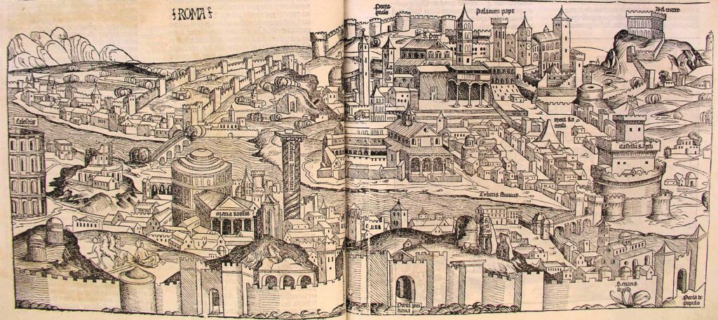
One example of these map/city-view that is useful to think with is the woodcut of Rome from the 1493 Nuremberg Chronicle

A full page spread image of Rome
A woodcut image of Rome from the 1493 Nuremberg Chronicle

This woodcut image clearly shows Rome – in addition to the label (which I will expand a bit on later), there are many recognizable sites – the papal palace, the Castel Sant’Angelo, the Pantheon, and the Colosseum. It is not a simple city view – the geographic relation between these sites shows the general layout of the city. However, trying to plot a path (or even just points) on a georeferenced version of this map is not feasible.

Georeferencing warps the map image, trying to get it to fit the points on the image to relevant points in the real world. Sometimes this warping can be very extreme, especially for certain kinds of transformations:

The map is warped beyond recognition in the attempt to georeference the map.
Mid-process attempt to georeference Rome
The map is warped beyond recognition in the attempt to georeference the map.
Mid-process attempt to georeference Rome

The control points (which link the image to geographic points) on this map do not line up well, since the spatial arrangement of the map/woodcut image do not line up with their geographic locations. This image shows the difference between the points on the 1493 map and the present day map, shown as blue lines.

Rome map georeferenced with visible control points that don't line up with the historical map
Rome map and control points

Another problem with a map like the Nuremberg Chronicle woodcut is that we don’t know what all the landmarks are. There are many church structures, but only a few are labelled. In addition, there are features that seem to be missing – for example, it is difficult to distinguish Tiber Island on the woodcut, which is a major landmark. Furthermore, the scale of the buildings pose problems. It is relatively easy to use the center of the Pantheon as a point on a present day map, but where on the woodcut image is the “center” of the Pantheon? In all, attempting to georeference and plot points on a map such as the Nuremberg Chronicle woodcut image of Rome is frustrating, inaccurate, and ultimately provides no additional insight. In fact, the extreme warping of the image makes it more difficult to understand the and the data represented in relation to it.

My attempt to chart a path on the Nuremberg Chronicle map

The closest point is the Colosseum – nothing else lines up very closely at all (the path is supposed to go from the Colosseum to the Pantheon, to one side of the Ponte Sant’Angelo, to the Castel Sant’Angelo, to the Vatican). The result is not illuminating and does not contribute any new knowledge, and in fact doesn’t serve either purpose well; it is difficult to interpret the Nuremberg Chronicle map, and it is almost impossible to know which landmarks are denoted by the path.

The path of points through Rome does not line up with the location of those points on the Nuremberg map
A path through Rome on top of the Rome Nuremberg Chronicle

Can we trust the labels?

In the Nuremberg Chronicle, no, we can’t! Rome is clearly correct – the sites confirm the label. Other cities are like this, including, for instance, Krakow, which gives specific labels of a part of the city and reflects the city layout. However, for more minor cities, the Nuremberg Chronicle often uses the same woodcut for different cities.


In fact, the same woodcut is used for nine images (see below). These images include: Napoli, Perugia, Mantua, Ferrara, Damascus, Bena (I’m not sure what city this refers to), a German province (not sure about this one either), Spain, and Macedonia. While Italian cities may have similar styles, I cannot accept that Napoli, Damascus, Spain and Macedonia literally looked like these woodcuts. Therefore, not only do these images provide difficulties in terms of spatial alignment, but we also cannot always accept them at face value, because they may be no more than a generic representation of a city than a visual representation reflecting an actual cityscape.

Sources:

The color woodcut images come from the digitized University of Cambridge Nuremberg Chronicle (CC BY-NC 3.0): (the page numbers are: Bena 80r, Damascus 23v, Ferrara 159r, Macedonia 275r, Mantua 84r, Napoli 42r, Germany? 284v, Perugia 48v, Spain 289v).

The woodcut image of Rome is from the digitized copy in Morse Library, Beloit College. Last accessed 16 October 2017.

RBMS/BSC Latin Place Names File provided help with place names.

La solution idéale pour viagra . Promotions exclusives en cours. Site fiable pour acheter viagra en ligne ! Sélection minutieuse des meilleurs produits. Le site le plus sûr pour viagra pas cher en France . Options de paiement flexibles. Choix de confiance pour acheter viagra à Paris . Des années d’expérience réussie. Активное Лев казино зеркало с уникальными предложениями Коммерческое casino Lev официальный сайт с мультивалютой Высококлассное Lev casino официальный сайт с новыми играми Популярное бонус казино Лев с бонусной игрой Доверенные игровые автоматы бесплатно с возможностью обучения Энергичные игровые автоматы с бесплатными спинами Исключительные игровые автоматы с интуитивным интерфейсом

To Map or Not to Map?

During this year’s fall DH training, the DHA’s got some practice using ArcGIS, an online mapping tool that makes it relatively easy to create your own customized maps in one sitting. This post discusses some of the pros and cons, advantages and pitfalls of mapping data. (Note that by mapping I am referring strictly to the use of geospatial maps, not to the more general application of the term that includes graphing.)

Why use a map? Mapping is fun and exciting, and it’s a relatively easy way to build a data visualization that’s interactive and easily facilitates instantaneous spatial comprehension of the data. For these reasons, people are often quick to jump on the “let’s map it!” train whenever there is spatially relevant data. But it’s important to stop and ask this question first: what will a map add to this project that other data visualizations will not? Sometimes, sparsity or lack of variation in your data should disqualify the map idea.

Take this example from Stanford’s Professor Martin Evans, which maps specific locations in and around London that are referenced in works written by authors from London. There’s an abundant amount of data in this data set, and the locations are spread all over London – mapping helps us understand the data, so mapping was a good choice. If, however, you were mapping only locations in London referenced by Sylvia Plath, you might think twice about whether the <10 data points clustered in one small location is worth putting on an interactive map.

Once you’ve determined that a map is worth your time, you might next consider what kind of spatial information you want to convey. Is the data represented well by points on a map? Or is there a path or order to these points? How can you visually differentiate between different paths or groups of points (hint: colors)? Try to create a map that accurately visualizes the story you’re trying to tell with your data. In this example, students at the Georgia Institute of Technology recreated the paths taken throughout the day by characters in Mrs. Dalloway. The smooth, continuous paths tell a better story than a series of sequential points would, and the colors make each path stand out from the others. Above all else, mapping should make it easier for your audience to understand your data, so think hard about how you’re transferring your data to your map. And use colors!

Don’t forget that an important part of mapping is the base map itself, not just the points you put on it. Much of the time, simpler will be better – if the story you’re trying to tell has nothing to do with the terrain of the area, don’t clutter your visual with a terrain base map. Humanities scholars are often excited about using historical base maps, which are historical maps that can be georeferenced onto a modern, digital map of the same location by matching specific points between the two locations. One common problem with historical base maps is that many historical maps are not geographically accurate, so georeferencing them can stretch and distort them to an unusable extent. For example, this 1853 map of Maine from the David Rumsey Map Collection is quite geographically accurate, and would work well as a georeferenced historical base map, but this 1935 world map of post office and radio/telephone services from the same collection is highly geographically inaccurate and would have to be significantly distorted to be georeferenced onto a modern 2-dimensonal map of the world.

Finally, consider how you will communicate the data for each point or path on your graph. Points and paths don’t always speak for themselves, and there will often be metadata or a paragraph of information that necessarily accompanies each data point. How will your user access this information? Is there a key that goes with the map? Do you click on a point to reveal the associated text? Does each point link to more information?

There are many ways to address the above issues and questions, facilitating lots of creativity and flexibility within each project. Above all else, no matter how you approach a mapping project, your map should always give a clear and intuitive answer to the question: what story is this map trying to tell?

Excellent choix pour viagra en France à Paris ! Actualités et tendances du marché. S’il vous plaît, visitez le site pour acheter viagra en France à Paris . Promotions exclusives en cours. Le premier choix pour acheter viagra sans ordonnance à Paris ! Sélection minutieuse des meilleurs produits. L’endroit à privilégier pour viagra prix en France ! Processus de commande sans tracas. Разнообразное казино Лев официальный сайт с моментальным выводом Доверенное казино Лев зеркало с уникальными функциями Престижное казино Лев официальный сайт с еженедельными акциями Востребованное бонус казино Лев с высоким процентом выплат Интригующие игровые автоматы с дополнительными возможностями Безупречные игровые автоматы демо с бонусом за регистрацию Загадочные игровые автоматы демо с удобными платежами